CALL US TODAY: (877) 786-3249 x3
Schedule a Strategy Session
 Building a solid mobile email strategy is important in order to succeed in the inbox. That’s because 81% of people regularly use their smartphone for reading emails according to the Adobe Email Use 2017 – US Report. This is a higher percentage than those who use their phones for making calls! Now, if that doesn’t make you want to work on mobilizing your email strategy, I don’t know what will.
Don’t waste your time creating a fancy email template with a complicated layout and dense content. In fact, for emails to render best on mobile devices, the simpler the better.
Your design should be what leads the reader towards the ultimate goal of the email blast. Utilize a layout that is easy to follow and a style-guide that is captivating. My favorite type of layout is a one-column template that uses a lot of white space to make the email easy to read and pops of color that direct my focus to the main goal of the email: the conversion. Not only is that more user-friendly and mobile-friendly. But, the fewer the elements in the design, the fewer chances of the design going out of style. If you are using an email platform like MailChimp or Constant Contact, a ton of great pre-designed, responsive templates are at your fingertips that can easily be customized. They make it so simple, you can literally create a mobile friendly template in under an hour.
The reason the majority of people are reading their emails on their mobile phones is because they are busy and on-the-go. So, make it as easy as possible for them to digest your content in line at the coffee shop or while they are waiting for a meeting to start. Break up the content with captivating headings, bullets, and numbered lists. And, use images and videos which are easy to view on small screens.
Images, videos and other visuals are a vital part of marketing your B2B products and/or services. However, you need to make sure there is a balance between no images and too many images. No visuals could disengage the reader. And, too many images could reduce focus and increase load time–a serious disadvantage since people don’t have the patience to wait. Make sure to add alt text to all images so that if the image doesn’t load, the description will be displayed and will give the reader an idea of what was meant to be displayed.
 4. Pay attention to pre-click display text.
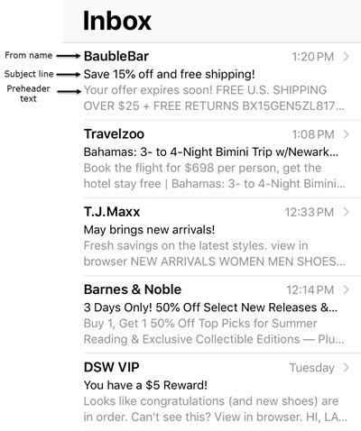
The “from” name, the subject line and the preheader text are all things that cannot fall by the wayside. All should be written with the intent to grab attention and make the reader click through to read the email. Keep the subject line and the preheader text around 30-characters to make sure all text is shown no matter the screen size. See examples of various preheader text displays at work and how each rendered on my iPhone 8 in the screenshot to the right.
Buttons are easier to see than hyperlinked text, especially on a mobile device. Just make sure to leave plenty of white space around the button to avoid a “fat finger” mishap.
Not only should your template and content be mobile friendly, but any landing pages that you direct visitors to should also render correctly on small screens. If not, you’ll lose them before they even convert. Worse, they may unsubscribe from your email and/or not purchase from you again.
Knowing the right tactics to apply to your mobile email marketing efforts will help you engage, nurture and convert your on-the-go readers.
Whether you currently send emails or you are starting from scratch, our Essential Guide to B2B Email Marketing is a great way to help you reach your company’s goals and objectives.
This guide explains why your company should have a B2B email marketing strategy and breaks down how to develop a solid strategy for building and sending an email to your target audience.
Reaching customers has become more and more complicated as new technologies have emerged over the past couple of years. Gone are the days of only focusing on desktop performance. Now is the time to fully embrace the power of mobile in order to stay ahead of competition. Check out our essential guide to B2B mobile marketing.
If you are interested in improving your email marketing strategy but don’t have time to do it yourself, or just don’t want to do it, we are here to help. Just contact us and one of our experts will schedule a free consultation.
